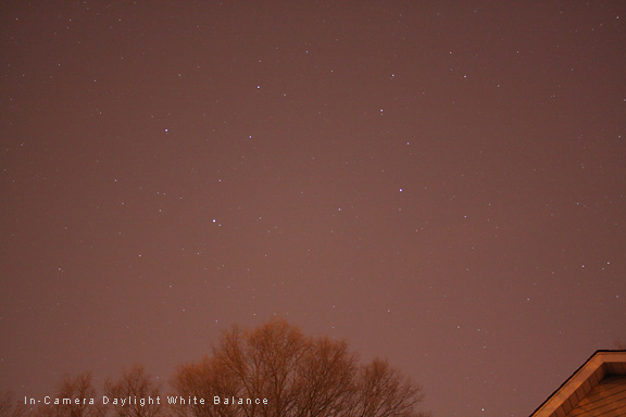
The image below was shot from my driveway in the severely light-polluted suburbs of Philadelphia. It was shot with daylight color balance. It recorded the red-brown color of the light pollution very accurately.
As we have already described, the best way to handle this problem is to shoot a custom white balance in the camera. But if you forget to do this, we can correct the color in IrfanView to a certain extent. Ideally, when you become more advanced, you will want to do this in a more sophisticated way in a more serious image editing program. About Colors
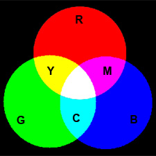
The primary colors are red, green and blue. When we combine two of the primary colors, we get one of the secondary colors. For example, if we combine blue and green, we get cyan. Cyan is opposite from red, it is its complimentary color. Each of the primary colors has a complimentary secondary color. The secondary colors are cyan, magenta and yellow.
Whenever we reduce the red in an image, we are shifting the color balance towards its complimentary color, in this case, cyan (blue-green). Likewise, if we reduce the blue in an image, we shift the color balance towards yellow. This goes for all of the colors. When you add or reduce one color, you also shift the color balance toward or away from its complimentary color. In our example image, the color of the sky is brown. Brown is just a dark shade of red. There may also be a little bit of yellow mixed in. So our basic task in correcting the color balance of this image is to remove some red. We can reduce the red in this image in one of two ways. We can just subtract red, which will also make the image darker since we are removing some of the color. Or we can add the complimentary color of red, which is cyan, by increasing the blue and the green. This will also make the image lighter because we are adding colors. In IrfanView, go to Image > Enhance Colors or use the keyboard shortcut of Shift+G.
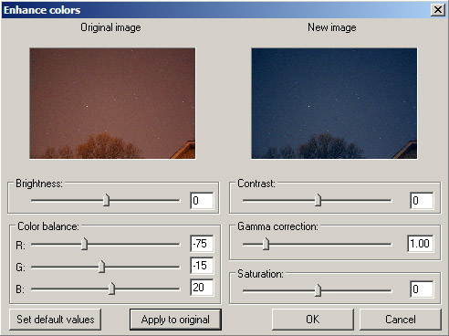
This dialog box will allow you to adjust the brightness and contrast of the image as well as the color balance. Right now we will just discuss color balance. The dialog box has three sliders, one each for red, green, and blue. You make an image more red by sliding the red slider to the right, and less red by sliding it to the left. Likewise for the green and blue sliders. In this example, I have reduced the red in the image by moving the red slider to the left to -75. When I did this, the image took on a slight green tint because all of the colors are interrelated. Remember, removing red shifts the color towards its complimentary color, cyan, which has green in it. To remove this green, I slid the green slider to the left to -15. This corrected most of the ugly red-brown color of the sky background and made it much more neutral. For aesthetic reasons, I also wanted the sky to be a little bit blue, so I have moved the blue slider to the right to add +20 blue. You can just play around with moving the sliders to see what results you get with your images in the small preview box. If you are working in full-screen mode, to better see what is happening, hit the Apply to Original button to apply the adjustments to the entire image. If you don't like the adjustment, just move the sliders and try again. None of the changes are applied to the image permanently until you click the OK button to close the dialog box. And even after you have OK'd the adjustments, you can always undo them with Edit > Undo, or Crtl+Z. The amount and type of color correction that you apply to your images will be based on your own personal preferences, but if you look on the web at other examples of images of the same object, you will get an idea of what it should look like. We'll discuss brightness and contrast adjustments in the next section. Limitations of This Method
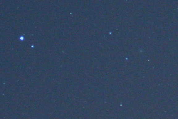
While this method can work to a certain degree to save an image that was incorrectly white balanced in the camera, it does have a major limitation. That limitation is that the color adjustments are applied to every pixel in the image. In this case, the color adjustments were also applied to the white pixels in the stars, and the stars ended up with a bluish tint also. This is why it is much better to get the white balance correct in the camera if you are shooting JPEGs. For advanced photographers, this star color problem could have been fixed with more sophisticated color correction processing methods.
|
|||||||||||
|
Back | Up | Next |