The digital file of a color image that comes out of a digital camera does not contain any colors, it contains only numbers. These numbers are translated into colors when the file is output, either to a monitor or printer. The problem is that every device is unique in the way it displays color. A picture can have different colors on different devices, even though the numbers in the file are exactly the same. Color management is a way of trying to keep colors consistent across a range of input, display and output devices. It tries to ensure that the colors are the same from when we see them and record them in a camera, to when we view them on a monitor, or print them on a press or with a printer. Since the pixel data in an image file contains only numbers and not colors, the question is, what do these numbers mean? What specific colors do they represent? A Color Management System (CMS) attempts to answer these questions by defining these numbers for each device that handles them. It attempts to make color device-independent. In a system with no color management, the color is device-dependent. The numbers in the data file stay the same, and the colors change with the output device. In a color managed system with device-independent color, the color stays the same from device to device because the numbers change. How do we know what to change them to? This is where the CMS comes in. Device Profiling Each device is profiled so that the way they work with color is known. The color management system then translates the numbers from one device to another using a reference color space based on human perception so the colors appear the same visually. For a CMS to work correctly, each device that creates a digital color file must first be calibrated to a standard and then its interpretation of color characterized. This process creates a profile that is used to interpret the numbers and turn them into colors for that device. Camera Color Space Like all other devices, each camera has its own color space and unique way of recording and interpreting colors. For critical professional color reproduction each camera should have its own profile created for it that characterizes its individual peculiarities. In the real world this is hardly necessary because this profile would only be good for the unique lighting conditions it was created under. Such a profile might be very useful however for controlled lighting conditions such as in a photographic studio. For our purposes and for everyday casual use, the camera manufacturers know their camera's characteristics fairly well because they are manufactured to a high degree of consistency. During in-camera processing for JPEG images, the camera's individual color is translated into a standard color space, such as sRGB or Adobe RGB. For raw image files, the data is not in a particular color space until we specifically assign one later in processing. The color space that the images are in when they come out of the camera gives us a starting point for a color managed work flow. The images are then opened in Photoshop or another image processing program where they are worked on, usually in the same color space. Finally, before output, a copy of the image is converted to the color space of the output device and the numbers in the file are changed so that the colors come out correct. Profiling Your Monitor Your computer monitor is the first device you will use to judge the colors in your digital file. The computer takes the numbers in the file and interprets them and turns them into the colors you see on your monitor. It is important for your monitor to be set up correctly so that this interpretation presents the correct brightness and color of your image. Calibrating the monitor helps eliminate any color casts the monitor may have, makes grays neutral and sets a standard white point. Characterizing the monitor describes how the monitor displays colors. This information tells the color management system what we are seeing when a particular color is displayed. This information is stored as an ICC profile on your computer. The profile is used when the image is displayed or printed on a different device to ensure consistent color. The most accurate way to create a monitor profile is with a hardware profiling device. If you don't have a hardware device to calibrate your monitor, then you can try to use the grayscale step wedge as described below. But, note that there is no question that using a hardware calibration device is the best way to calibrate your monitor. The human eye is just too adaptable to make critical color calibration decisions. Let the monitor warm up for at least 30 minutes before you try to calibrate it or do any critical color work on your images. Keep the ambient lighting conditions the same when you calibrate as when you will work on your images. The ambient lighting should be off or very subdued in your computer room for critical work. Note that most LCD monitors come with the default setting for luminance, or brightness, set way too high. Turn it down!
Grayscale Step Wedge At the very least, if you don't have a hardware calibration device for your monitor, or a copy of Photoshop, you should adjust the brightness and contrast of the display by examining a grayscale step wedge. As always, let your monitor warm up for at least 30 minutes before adjusting it, or doing any critical work. Make sure the ambient lighting is the same during the adjustment as when you will be using the monitor. Display a grayscale step wedge and make sure you can see all of the steps. You can right click on the one here with the black background and use it for your adjustments. Set it as your desktop wallpaper because most web browsers don't display images correctly. Note that the brightness of your viewing environment as well as the brightness of the screen background will make a difference in how the grayscale step wedge appears. When viewed against a bright white background, the dark steps will appear darker. Then viewed against a black background, they will appear lighter. Take this into consideration when you adjust your images for viewing based on the background colors of your web pages. Notice how the visibility of the darkest steps changes based on the background color. These differences would be even more pronounced if the entire screen were black or gray or white. If you can't see all 18 steps, your monitor is not adjusted correctly. Note that when you adjust your monitor, the blackest step should be made as black as possible while still being able to differentiate it from the next darkest step.
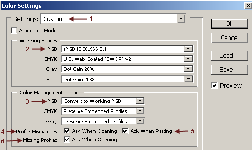
The grayscale step wedge in all three of these images is exactly the same. It is our perception of them that is different, based on the brightness of the area surrounding them. I would recommend setting the color of your desktop to a dark gray. Then set the grayscale step wedge as your desktop wallpaper. If you just center it, and don't tile it, it will be small in the center of your screen. Then adjust the brightness and contrast of your monitor as described above. Setting the Color Space In Photoshop A color space is a three-dimensional model for mathematically representing colors with numbers in a coordinate system. Specifying a color space gives meaning to the numbers in a digital file. It says, metaphorically, that the numbers 200, 0, 0 in sRGB color space represent the color "fire-engine red". By defining the colors in a given color space, we can then translate these colors for different output devices, such as printers and monitors, so that the colors stay consistent. In Photoshop, go to Edit > Color Settings. Depending on the version of Photoshop that you have, this might be in a different menu or have a slightly different look, but the basic settings will be the same.
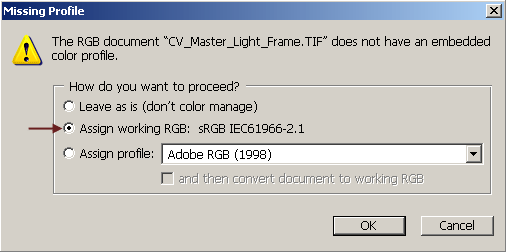
Note that you do not want to set Photoshop up to use your monitor profile as its working color space. Use either sRGB or Adobe RGB (1998) as your working color space. When an image first opens, Photoshop looks to see if there is a color space profile attached or embedded in the image. It then looks at the color settings to see what to do. If "preserve embedded profiles" is checked, Photoshop will open the file in the color space specified in the color space tag. If "convert" is set, Photoshop will convert the image from the color space specified in the tag to Photoshop's working color space. If the file opens and there is no color space tag attached to the file, the Missing Profile dialog box will open.
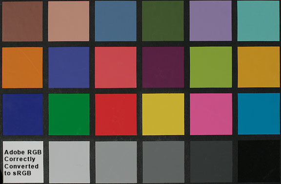
Here you will be given the choice of assigning a color space profile if you know what the color space should be. For example, you may know for sure that your camera is set to sRGB as the color space. Then you may work your files with another program that does not preserve the color space profiles in the file. When these files opened the next time in Photoshop, there will be no color space tag attached. In this case, simply assign the sRGB color space to the file. If the color space for the file is different than the working space that you have Photoshop set to, you will also have the option of converting to that color space. It is a bit more problematic when you open a file from someone else and don't know what the correct color space is. If you can check with them and find out, then you can assign the correct profile. If you can't find out which is the correct profile, you are probably best off assigning sRGB as the profile. You can also try assigning Adobe RGB and see which looks better. Assigning vs Converting Every device displays color differently. The colors that are defined by the red, green and blue numbers in an image file, will look different on every display device. In a color managed system, each device has a profile that describes how the colors look on that device. To keep colors consistent across different devices, such as your monitor and your printer, the numbers must be translated, or converted, from one device to another. Assigning a color space to a file defines the colors of the numbers in the file. Assigning does not change the numbers. Converting from one color space to another, on the other hand, actually changes the numbers in the file. This has to be done to keep the color consistent from one device to another. For example, the RGB color values for "fire-engine red" may be 200,0,0 in the sRGB color space but in the Adobe RGB (1998) color space, that same color may be defined as 170,0,0. To keep the "color" the same, the numbers have to be changed. The question of converting to a different color space usually comes up at two different times. When the image first opens in Photoshop, and when it is output to another device. If you are shooting in the Adobe RGB color space in your digital camera and you have sRGB set as your working color space in Photoshop, when you first open an image, you will have to decide whether to convert or not. Adobe RGB is a larger color space than sRGB. This means there are certain colors that can be represented in Adobe RGB that cannot be represented in sRGB, mostly in the green and cyan colors. If these colors are actually present in your image and you convert, you will lose them. That's one of the reasons why it's always a good idea to archive the original file out of the camera and work on a copy. These colors are not present in most astronomical images of emission and reflection nebulae and stars, but they may be present in planetary nebulae. I would suggest that if you really understand color spaces and color management to shoot in Adobe RGB and keep the image files in that color space until you are ready to convert the image to the color space of the output device. I would also suggest that if you do not really understand color spaces, you shoot in sRGB in your camera and keep the image in sRGB when you work on it. Unless you are shooting incredibly vivid colors such as landscapes with autumn foliage in late afternoon sunlight, you will probably never see the difference.
The other time you should convert is when you output. If your image is destined for display on the web, it should be converted to sRGB if it's not already in that color space. If your image is to be printed, it should be converted to the color space of the printer. Don't forget to archive the final version of the color corrected and enhanced image before you convert to another color space. |
||||||||||||
|
Back | Up | Next |